Creating Generali
Mobile App Design
Made to help people in difficult times
The software that I used for this project:

Sketch

Craft

inVision

Abstract

Trello
Photoshop
Illustrator

PowerPoint

InDesign
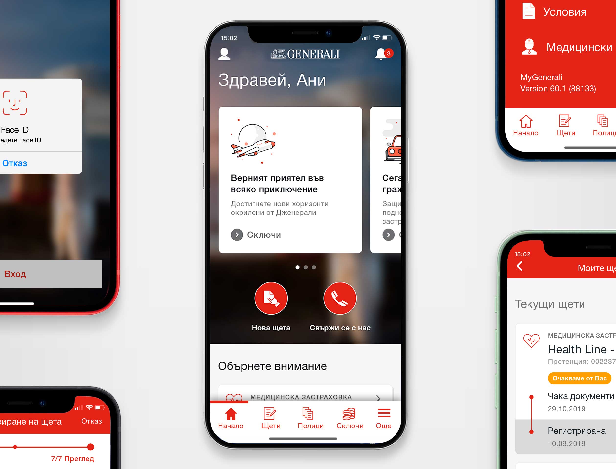
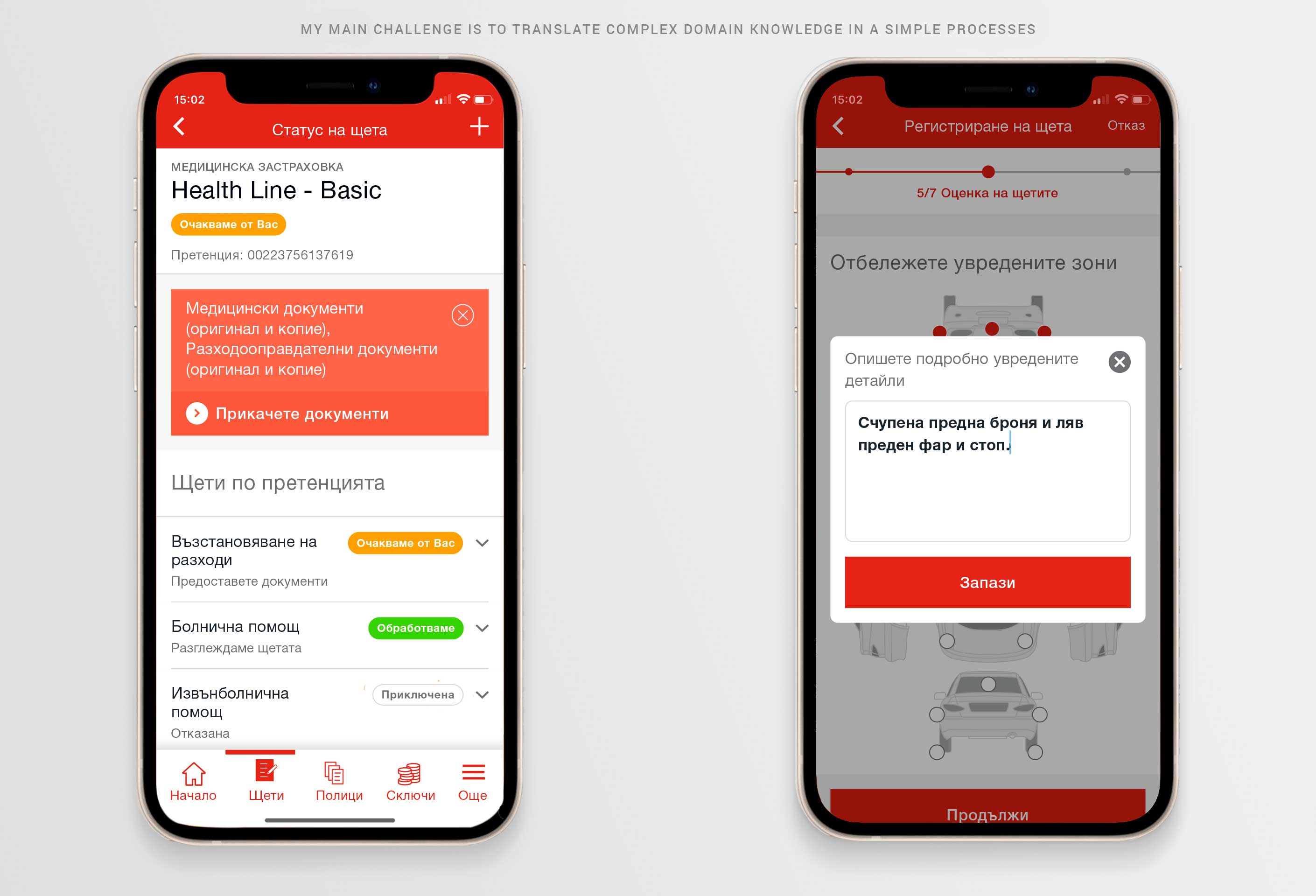
Think about one of those days, when things don't go as planned. Your attention is fragmented between what happens around you and the bureaucratic chore that you need to do from your phone. Typing is hard. What if we could provide you with a way to describe damage to your vehicle or property from your phone, which is even easier than doing the same from your desktop computer. What if you could do this in a matter of minutes?
Design Role: UX Design, Visual Design, App Icon Design, Printables, and email campaign.
At the end of my contract, I delivered: User Surveys, Competitive Analysis, Personas, User Stories, and Flows, Paper prototypes, Wireframes, User Testing, and Visual Design, and Interactive Mobile App Prototypes. You could test my prototype here.
Here are just a few of the processes and changes that I made.
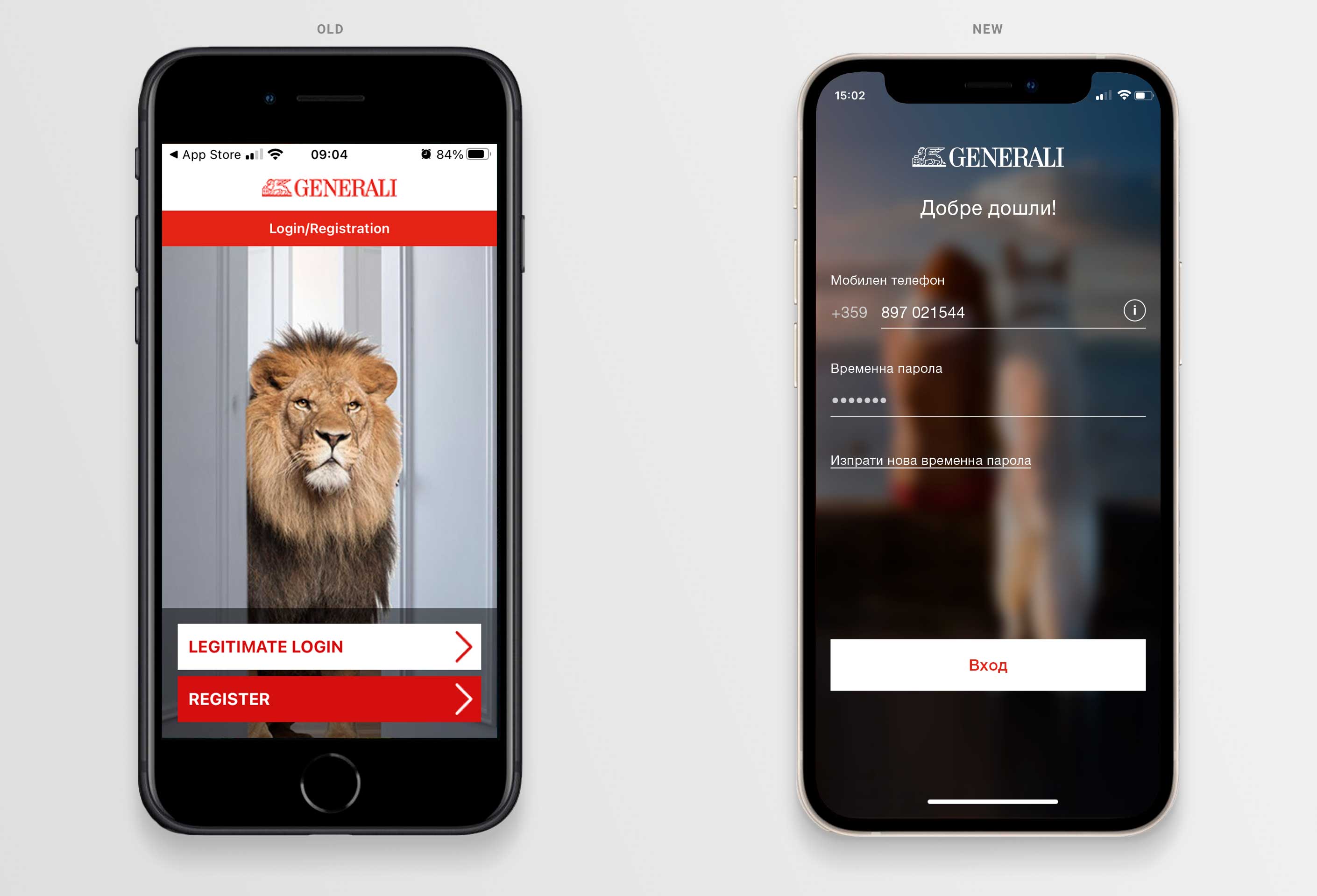
Entirely new login design
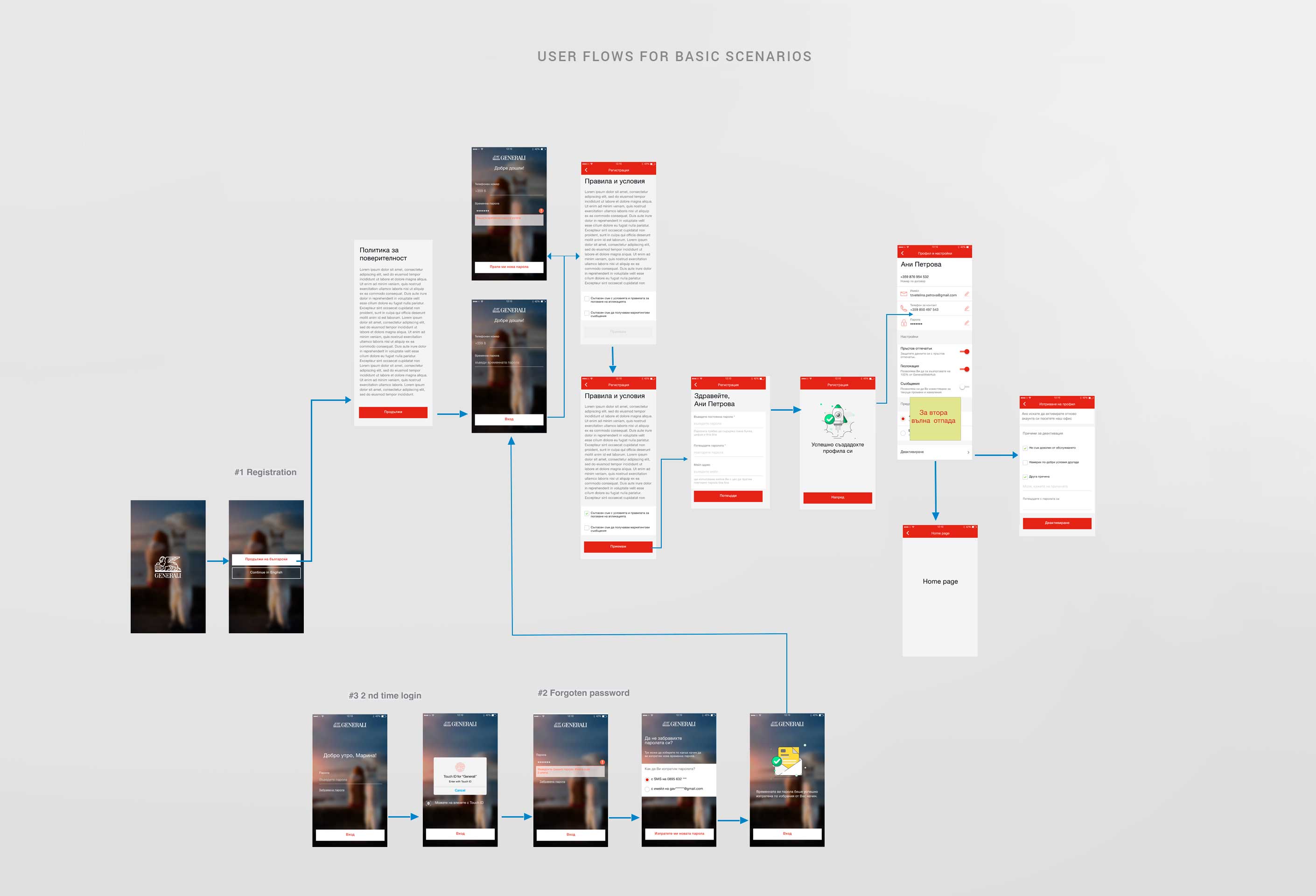
During the autumn of 2019, I was part of a team that redesigned the Generali Bulgaria Mobile App. Here are just a few of the changes I delivered. Most of the old applications didn't function at all, that's a reason why most of the processes in the app are built from ground zero. Log-in design is a critical part of the user experience. The main goal of the app is to drive more and more potential visitors to MyGenerali. The design needs to be seamless, attractive, and at the same time easy to use. The login area needs to be obvious. Everything is front and center. I designed an entirely new process of fallback when authentication methods fail so that the app holds sensitive information in client accounts.
Simplify processes
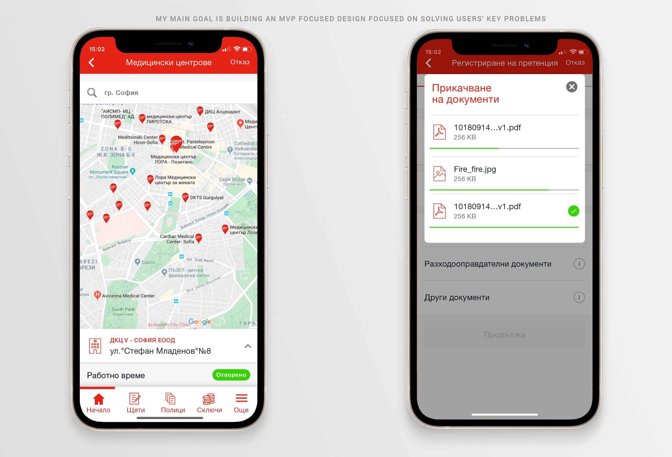
My main goal was to simplify entering information. To achieve that goal I created simple interactions and a very clean interface of the app and cut the all process into smaller, simpler steps. Made car inspection easier by adding tips on the screen on how to file a claim for damages.
Tricky decisions ina limited space
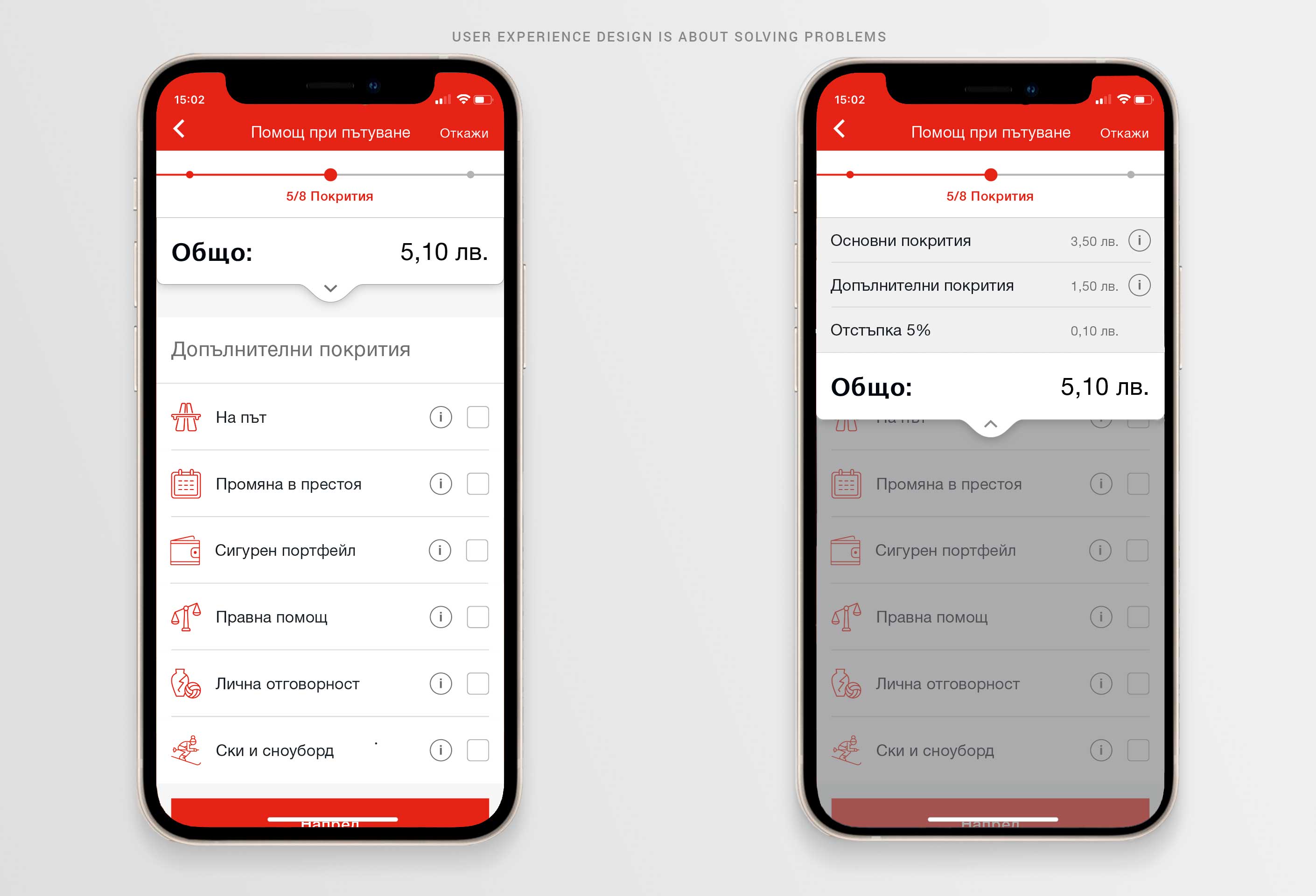
One problem emerges during the purchase of travel assistance insurance, the problem is that price changes dynamically with the addition of new coverages that are selectable. That's why I created a dropdown menu to serve the purpose to show user price during all the steps.
Made to help people in difficult times
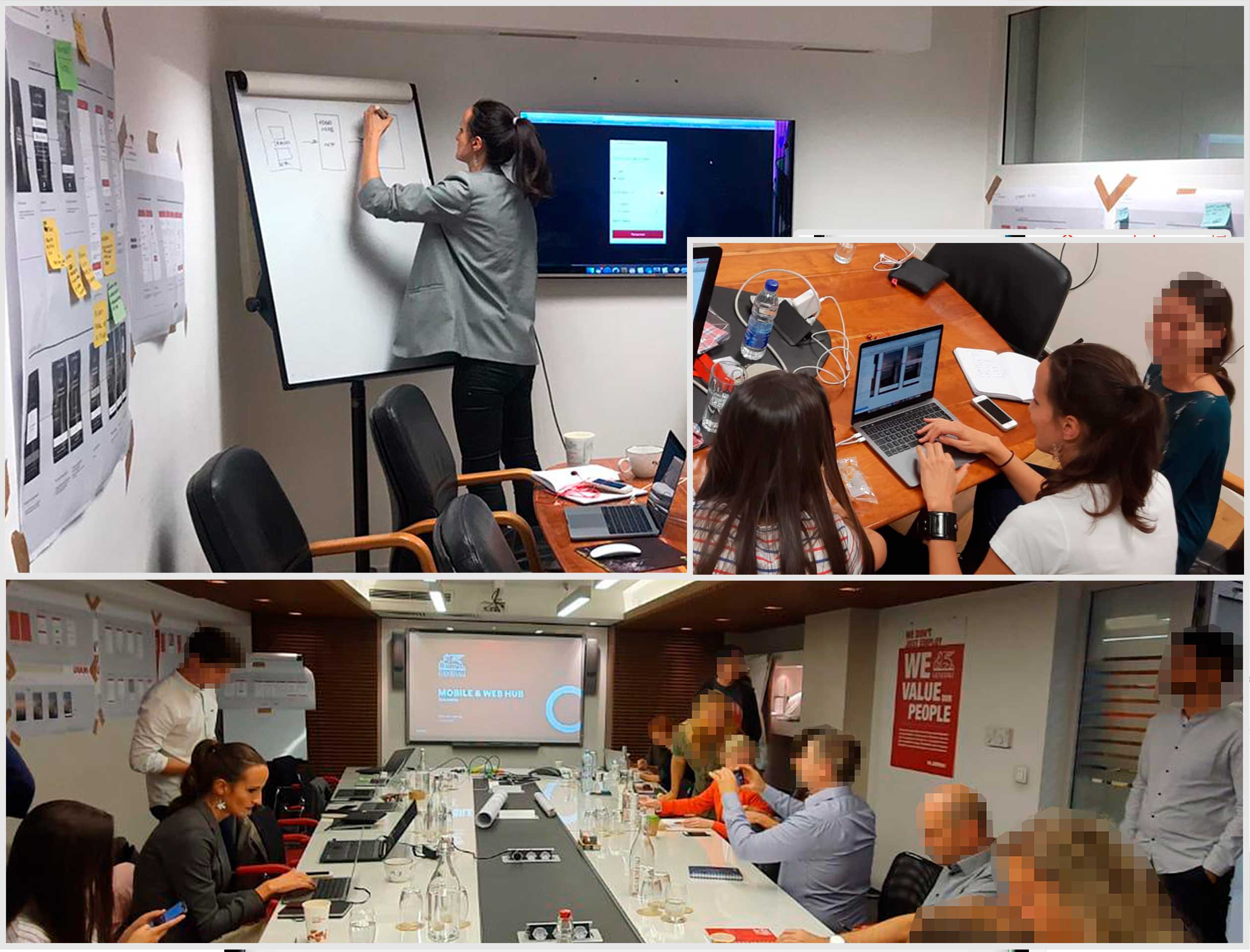
I became part of a large project whose goal was to create a new, more intuitive design for the client portal of Generali. I worked alongside Fjord design studio to build a client-oriented interface that served stakeholders' needs. I worked on an intensive eight-week design sprint till I gathered all the information that I needed to streamline the processes of describing claims or buying a new insurance policy. A critical part of my work was the collaboration with key stakeholders to define product expectations. During the meetings with stakeholders, I learned a lot: about the insurance business in general, about the various insurances that are offered in the Bulgarian market, about the way that damages are claimed, how insurance policies are issued? How are health insurance claims handled?
At the end of the meetings, we had enough information to start work. The main processes were perfected and detailed at a later stage.
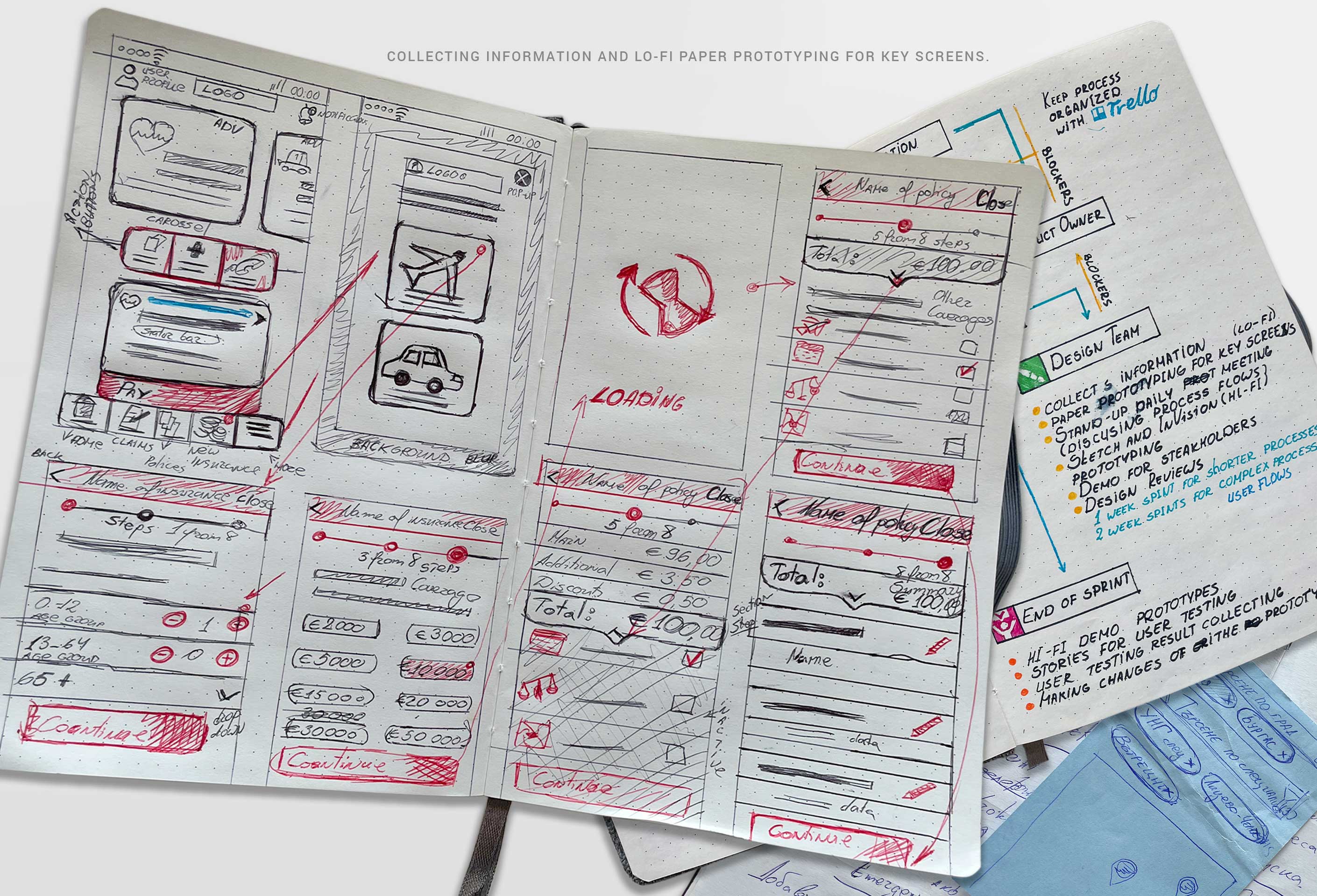
After these meetings, I made paper prototypes of the main screens, which would later be assembled into HI-FI Prototypes in Sketch. These are some of my notes. With user scenarios and flows in place, I can begin sketching.
Built interactive mobile app prototypes for usability testing
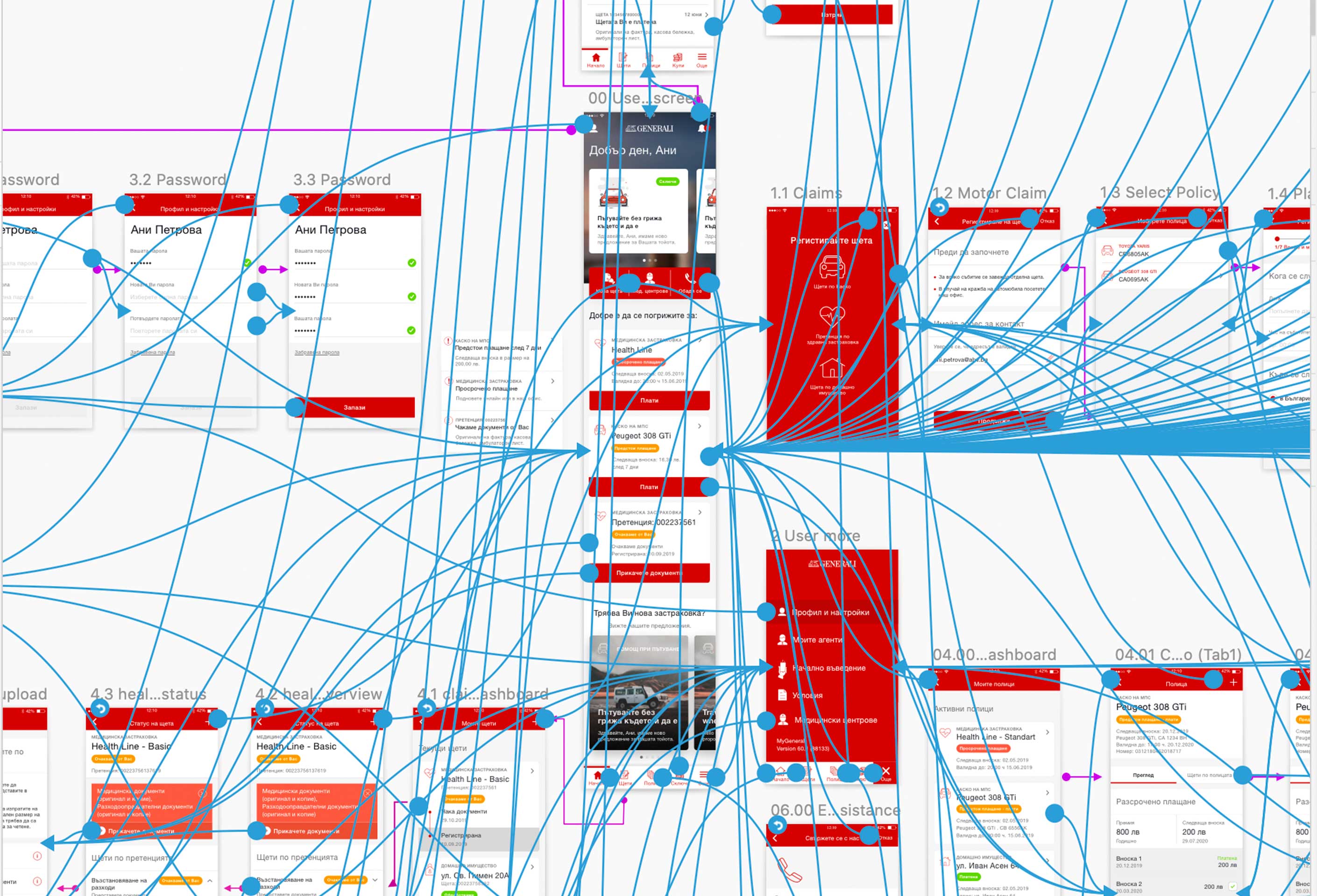
After gathering all relevant requirements from stakeholders and streamlining fragmented processes I needed to put all the information together, which I achieved via inVision and Craft PoC/prototype app. This is a print screen of all the interactions that need to be done to create an interactive mobile app for user testing purposes. After I created high-fidelity wireframes we were able to get user tests to validate the newly created flows.
User testing
During the creation of the high-fidelity wireframes, I was able to perform a couple of user tests to validate the confusing instances. Above is a video of one of the people who participated in a user test that we conducted. Some of the biggest takeaways from the initial user tests were duplicating the functionality of action buttons and the bottom bar. I changed the transitions from slide left to dissolve. There were changes in the wording of some sections.
